Thursday, 25 March 2010

Our draft

Our draft had some good points and some bad points, our draft had a good build up to it and we also had a good office scene we will use more the shots in the office scene in our final film. In the walking down to the fight scene we had a number of good shots when running for example we had a number of good shots including a point of view, we made the running scenes fasted paced which adds a needed tempo. We have also considered removing the walking scenes and replace then with a car pulling up instead.

The bad points of our draft are that we had a poor fight scene this is because we did have enough cuts we just kept the one camera shot throughout the fight, this didn't give the audience a sense of pace and it just doesn't seem realistic.

Again like in our preliminary we have learn't about how to make shots more realistic, more dynamic and we have more experience with the mac computers and the camera, these experiences will help us a lot with the final film.

My Interests!

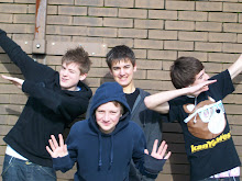
My name is jack, im 16 I live in a town called lutterworth which is near Leicester

My true passion is sport and mainly football!
My other interests are football, spending time with my mates, and music.

Final Film Location


We have used this as our final location because it is a long road that we can drive down for our car scenes and it also has a lot of alley ways coming on to the road so we can take advantage of this to use different shots. The road also leads to a grave yard which will be good to have the fight scene because it has lots of space and good high shot opportunities, especially for a CCTV shot of the fight scene. We have got permission to use this location for our film so we are good to go!

Tuesday, 23 March 2010

Monday, 22 March 2010

Film Logo

Feedback

My teacher said our draft needed a few improvements, these are such things as lighting, titles, music, and our actors.

The lighting was poor in our draft because we filmed late on in the day where it was starting to get dark, this cause our film to look really dark. Therefore the background of our film was to dark and towards the end of the film it was hard to see the characters.
From this point we have learnt that we need to film earlier on in the day, and the cameras make the scene look darker anyway.

Our titles in our draft had a few problems with them, for example we were told that they were plain and boring, we were told that we needed to make them stand out to play with some fonts to see what one had made the film look better and a font that would suit the genre.
With this feed back we looked a different fonts we had avalible to us and we picked a more unique and appealing font for our titles.

In our draft we didnt include any music so in our film you could hear the background noise of cars, people walking by, etc. So we were told that we would need something to cover it, but also to make sure the peice of music was perfect for our film.
We used the information we were given and we desided to look at some copyright free websites where we could get music pre-made for our film that didnt have a copyright on them. We also used the 'Garage Band' program on the mac computers so we made our own music for the film.

The actors we used in our draft film were the same age as us, this was easier to arrange and to get everyone together but in our film it didnt look right because sixteen year old lads wouldnt be handling valuable packages for someone. So our teacher advised us to try and get older actors to add realism to our film.
Using this advice we asked Will's dad if he would feature in our film along with some other adults.

Friday, 19 March 2010

Film Ident


This ident is good because it is bright and it attracts attention, theerefore advertising the film company. It is mordern and will attract a younger audience which is our target audience. This logo has its bad points also, it doesnt fit in to the genre our film is in. Our ident needs to be bright but it maybe to bright, and may seem like a childs genre.

This ident is good because it is clear to read, and is bold so it will be good to see on the screen while the film is being played it also fits well in to our genre it has a sort of action feel about it. The bad points are that it is boring and dull, this may discourage audiences to look at our films.


The ident above is good because it is stylish which also fits in with the name 'Style9' it also grab attention because it is different and unique. It will also stand out in the film when it is being watched. The bad things about the logo is that it may be hard to read because the 'Y' isnt very clear, also the colour of the writing isnt very attractive for the target audience.